A Narrative of Movement and Memory in Quantified Self-Tracking
Introduction
Quantified Self aims at providing people with self-awareness and self-knowledge through the collection of personal data. (Hilviu & Rapp, 2015) In the age of digital self-tracking, individuals increasingly collect data on various aspects of their lives to better understand their behaviors, routines, and environments. Over the course of a few weeks, I tracked three types of personal data: my daily step count, the geographic locations I visited, and the time I spent visiting geographic locations. I visualized this data using line graphs, pie charts, bar charts, and heat maps, allowing me to gain insights into my behavioral patterns, including swings in my physical activity and how often I visit certain locations. This paper presents my findings, discusses the visualizations created, reflects on the meanings implied by this data, and makes suggestions for optimizing daily life based on the data collected.
Data Collection and Methods
The data used in this paper comes from three main sources: my daily step count, location data, and time spent in location. The step count data is recorded using the Health app on my iPhone, which is automatically recorded by the phone’s sensors. The location data and time spent in the location were recorded using the Rond app. For the purpose of this analysis, I cleaned the data and removed any irregularities or missing content. The step count data is divided into three parts: the step data is divided into daily step counts from 5th March to 16th April, weekly counts of the total number of steps, and comparisons of steps taken on the same day over multiple weeks (e.g., comparing data on Tuesdays). Location data is then grouped according to high and low frequency of visits.
To visualize the data, I used a few different types of charts: a line graph, which is used to represent the change in step counts from day to day, allowing me to observe trends and swings in my activity from day to day; a bar chart, which reflects the difference in the total number of steps walked per week; and a heatmap, which is used to show the frequency of visits to a certain location, giving an insight into the spatial distribution of my activity, revealing the locations that I visit the most often. Finally, a pie chart, which shows the percentage of time I spend in different locations.
Data Analysis and Visualization
Step Count Analysis
The first part of the analysis involves examining the daily step count data. I plot my daily step count on a line graph that reveals some interesting trends.
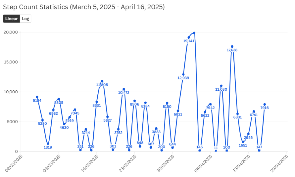
Figure 1
My steps data has a lot of ups and downs. One notable pattern is that a very active day is often followed by a less active day. For example, after a long-distance step, the next day’s activity level usually drops off dramatically. This reflects the fact that I often compensate for my physical exhaustion by resting at home after a long walk. This was particularly evident when I went on short trips to other cities; for example, I went on a short trip to Edinburgh in the UK on the 2nd and 3rd of April, and my step counts on these days were as high as 19,141 and 19,902, but on my return to Cork on the 4th of April, the step counts dropped to 145. I think those two days of walking must have taken a lot out of me to make me not want to go out the day after I arrived home and just want to lie down.
I also plotted bar graphs of total weekly step counts on a weekly basis and line graphs comparing step counts for each day of the week (from Monday to Sunday) over several weeks to observe changes in daily activity over time.
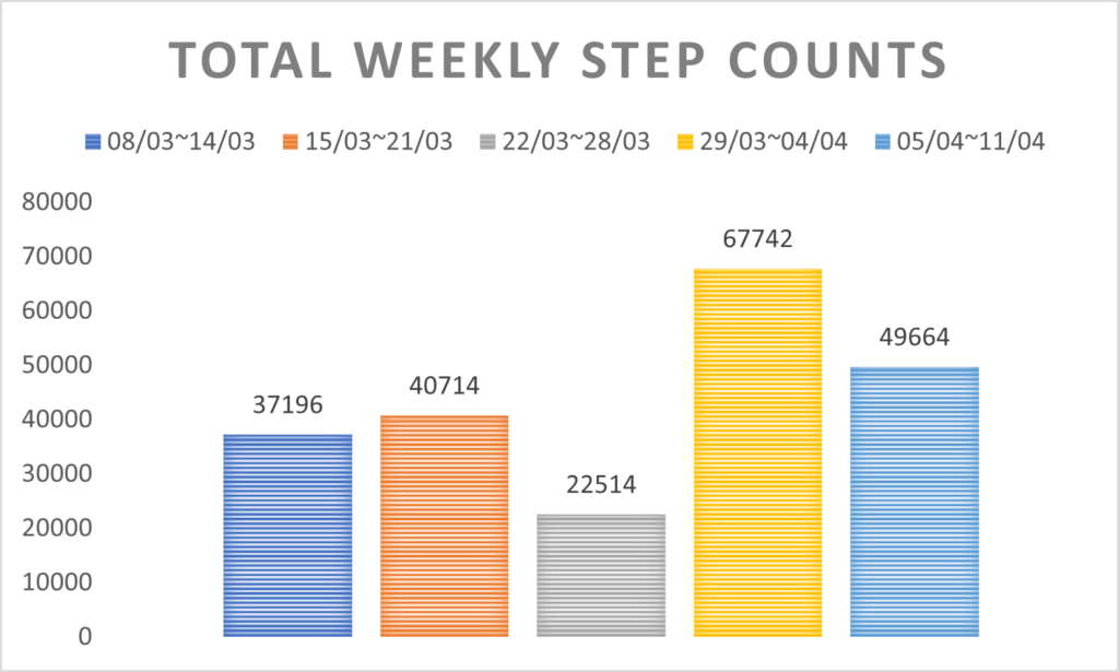
Figure 2
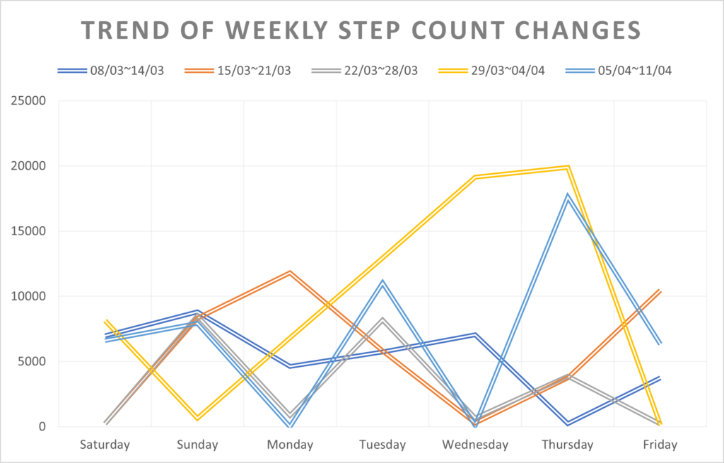
Figure 3
As seen in Figure 2, the step counts for the two weeks from 29th March to 11th April were higher than the average weekly step count. From the Rond APP and the weather APP, I know that I went to Edinburgh and Dublin for short trips in these two weeks, and the weather in these two weeks was mostly very good, very suitable for outdoor activities. That’s why the step count is above the weekly average. So why was the step count so low from 22 to 28 March? I learned from looking through the chat logs of social media apps that my group members and I were making final adjustments for our video essay during this time. Because there were so many parts that needed to be adjusted among the group members, we stayed in the dormitory most of the time and basically didn’t go out except for classes and shopping for supplies. As you can see, my weekly step count is tied to my weekly schedule.
I also compared the step counts for each day of the week (from Monday to Sunday) over several weeks, hoping to find a pattern. Yet it turned out that there was no pattern to be found. In contrast, the step counts on Tuesday were more consistent, probably due to the more fixed schedule and relatively limited range of activities on that day. This finding also suggests that fixed schedules and tasks in life can affect the regularity of physical activity. Overall, although I did not find a fixed pattern in my weekly step counts, the variations in the data reflect the variety and flexibility of my daily schedule of activities and tasks. It’s true that I don’t have a set schedule in my daily life, and I often do whatever comes to mind, but this has led to a less regular life as well.
Heatmap Analysis of Activity Areas
The second part of the analysis involves examining the heatmap, which visually represents the frequency of visits to different locations.
The heat map shows that besides home, the places I visit most often are near schools and supermarkets. These areas are shown in dark red on the map, indicating a high frequency of visits. The heat map also shows that my activities are mainly restricted to a small geographical area, indicating that I have a small activity circle. This suggests that my daily activities are focused around home, school, and the supermarket, and that there is little variation in where I visit. The map also shows the exploration of a new city while traveling to other cities. These areas are visited rarely but are widely spread. In this case, data becomes a tool for memory construction. Lyall (2024) argues that self-tracking helps users reflect on autobiographical memory through visual and numeric representations.
Time Use Analysis
In addition to the step count and location data, I also analyzed the time use data collected by the Rond app, which provides a visual presentation of how much time I spend in different activity contexts each month. While many of the app’s automated activity labels were inconsistent or unclear, the data on time at home was accurate and reliable. This allowed me to use time at home as a meaningful analysis point.
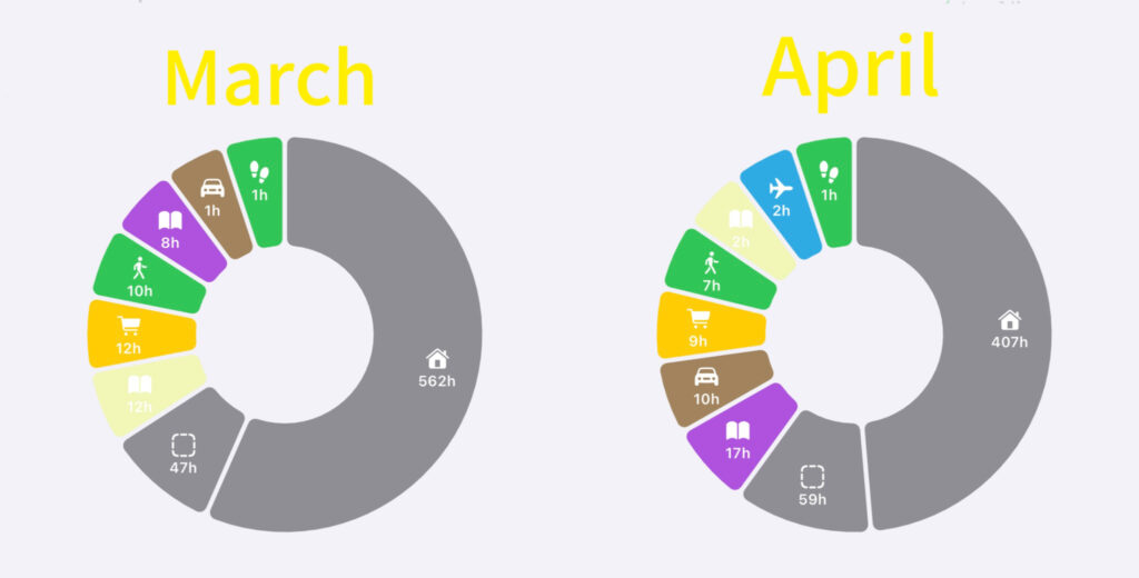
Figure 4 and 5
As Figures 4 and 5 show, with the collected data to date (5 March to 22 April), I spent 562 hours at home in March and 407 hours at home in April. These data represent a substantial portion of my time spent at home during these two months and confirm that home is my primary activity space. Supermarkets and schools are also very dark in the heat map, indicating a high frequency of visits. In the pie chart, we can also see that the time spent in the supermarket in March was 12 hours, and the time spent in school (including lessons and self-study) was 20 hours. 9 hours were spent in the supermarket in April, and the time spent in school (including lessons and self-study) was 19 hours. This shows that I really like shopping in supermarkets, and this can even be said to be one of my after-school activities. However, the Rond app’s lack of accuracy in other time categories reveals the limitations of self-tracking tools. However, the Rond app’s lack of accuracy in other time categories reveals the limitations of self-tracking tools. Although it is possible to record step count data and frequency of visits as well as time of visit, timekeeping apps are often unable to accurately record mental or emotional labor, such as activities like writing, thinking, and so on.
Analysis of the above charts reveals several patterns about my behavioral patterns. Firstly, swings in step counts can be attributed to a number of factors, including physical recovery from high-intensity activity, weekly class schedules, and external events such as traveling. Secondly, the heat map analysis showed that my activities were focused in a small area, mainly around my home, school, and supermarket. This is also validated again in Figures 4 and 5, where I spend the most time at home, followed by school and the supermarket. I seem to be able to see my three-pointed life in these figures.
Reflection
While this project provided valuable insights into my daily activity and movement patterns, it also highlighted several limitations of self-tracking practices. Firstly, digital self-tracking devices and software recording personal information are one element of this process of digitization. (Lupton, 2016) Although digital self-tracking devices and software clearly recorded my step count and location, the data was not always complete or accurate. For example, I used two apps to record my daily step count, and one of them discontinued the data collection for a week; luckily, the other app recorded the complete data. Also, the Rond app was inaccurate from time to time when recording location sites and had to be adjusted manually. This demonstrates the high dependence of this project on technology and the possibility of distorted conclusions when data is incomplete.
Second, while the numbers may seem objective, the process of selecting, decoding, and narrating the data is highly subjective. I chose which data to visualize, as well as which days to highlight. In this sense, self-tracking becomes a form of self-presentation, not just measurement. For example, I mentioned earlier how one week in March, my step count was below average, and while there may be many explanations for this, I subjectively assumed that it was the fact that I was in my dorm room completing homework that led to the reduced step count. Numbers may seem objective, but they only become meaningful through personal interpretation.
At the same time, this process has allowed me to become more connected to my daily activities. Instead of seeing exercise as just a task or habit, I began to appreciate the variety and unpredictability of everyday life. Even days with low step counts became interesting once I started to think about why they happened. As Lupton (2016) suggests, private self-tracking can promote personal growth by encouraging users to pay more attention to their own behavior and feelings. For me, this kind of attention inspires me to be passionate about my daily life and to start noticing subtle changes.
This self-tracking experience not only identifies one’s own patterns of behavior but can also have an impact on future behavior optimization and life improvement. Self-tracking can be a tool for personal optimization by allowing individuals to make more informed decisions to improve their daily lives, health, and overall well-being by continuously collecting and analyzing data from all aspects of their lives. As this analysis has shown, quantitative self-practice can help individuals gain insight into their patterns of behavior and health to make more informed decisions. According to Lupton (2016), self-tracking can help individuals take control of their lives to make data-driven decisions that are consistent with their health and lifestyle goals. I think I could also integrate other forms of self-tracking data afterwards; for example, tracking activity routes, calorie intake, or stress levels would give me a more complete picture of my lifestyle and allow me to make data-based decisions that would not only improve my health but also allow me to have a more balanced and fulfilling life.
Conclusion
This self-tracking project has provided me with valuable insight into how data can be used to reflect a person’s daily life, routines, and habits. By tracking my step count, location, and time spent in a location, I gained a deeper understanding of my physical activity, movement patterns, and the way I interact with my environment. While the process was inspiring, it also revealed some of the limitations of self-tracking tools and how to critically interpret the data.
The step count analysis highlights the varied nature of my daily activities. High activity days are usually followed by a decrease, especially after traveling or heavy physical activity. I found that having a regular routine made my step count more stable (e.g., Tuesdays). This finding confirms that a structured routine can influence physical activity. In addition, the heat map showed that my activities were concentrated within a small area, mainly at home, school, and the local supermarket, suggesting that I tend to stay in a relatively fixed space most of the time. The pie charts representing time spent also reveal this.
However, the data also revealed the shortcomings and challenges inherent in self-tracking. The Rond app provided much data, but due to the app’s categorization, the targeting was inaccurate, and the data was less reliable. This has brought attention to the limitations of self-tracking technology: while it can measure certain aspects of life, it often fails to capture the more subtle, emotional, or recognized elements of everyday life.
Despite these limitations, this project helped me to look at my daily life through a different lens. Not only did self-tracking provide objective data, but it also prompted me to reflect on my schedule and the factors that influence my daily choices. By critically analyzing the data, I became more aware of the patterns that shape my daily life. This reflective process renewed my interest in how small changes can improve my well-being.
Overall, this experience of self-tracking demonstrates that while data can provide useful insights into behavior and habits, they must be interpreted in the context of individual experience. The challenge is not only to collect the data but also to reflect on it in a meaningful way that leads to positive change. The quantified self, when viewed with a reflective mindset, can be a powerful, though far from perfect, tool for understanding one’s life. It is a reminder that data, like memory, requires a narrative to be truly understood.
References
Hilviu, Dize, and Amon Rapp. 2015. “Narrating the Quantified Self.” ACM UbiComp/ISWC ’15 Adjunct.
Lupton, Deborah. 2016. “The Diverse Domains of Quantified Selves: Self-Tracking Modes and Dataveillance.” Economy and Society 45 (1): 101-122.
Lyall, Ben. 2024. “Narratives in Numbers: Sociotechnical Storytelling with Self-Tracking.” Memory, Mind & Media 3 (1): 1-20.